



The Brief – Paint Packaging Design for Seawhite
Seawhite of Brighton is a leading UK manufacturer of art materials for education, artists and retail. This paint packaging design project developed a new identity for their artists’ and student paint ranges, combining illustration, branding and original artwork to create a coherent product system.
The range includes artists’ oils, watercolours and water mixable oils, alongside student oils, acrylics, gouache and watercolours, plus a related set of watercolour pencils.
The brief was to design packaging that:
- Creates a clear visual system across multiple paint types and grades
- Differentiates artist and student quality without breaking brand unity
- Communicates paint medium clearly and quickly on shelf
- Strengthens Seawhite’s established packaging language
- Introduces a distinctive visual identity for a new product range
- Ensures consistency with Seawhite’s wider art materials offer
The challenge was to build clarity across a complex range while maintaining visual richness and recognisable brand structure.
Packaging Design Inspired by Historic Paintings
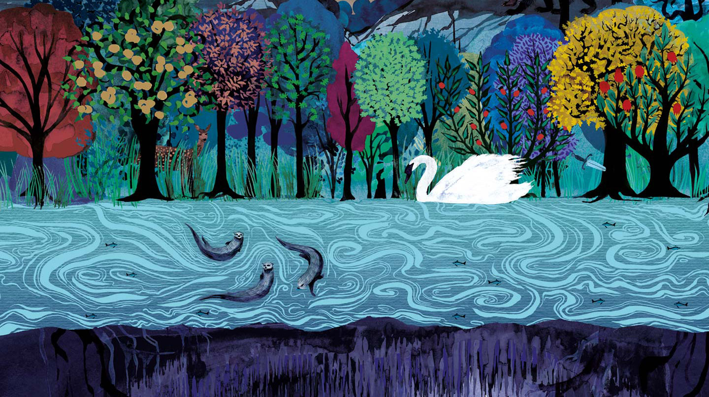
Rather than decorating the boxes with generic brush strokes or stock imagery, we based each design around a recreated historical artwork.
Each painting drew inspiration from an established masterpiece that had entered the public domain. However, these were never direct reproductions. Every artwork was painted again from scratch, preserving the overall composition while allowing creative freedom over colour, detail and texture.
This approach produced packaging that feels familiar without becoming derivative. It also celebrates the history of painting while giving the range its own distinctive visual identity.
Packaging That Demonstrates the Paint
The recreated paintings also serve another purpose.
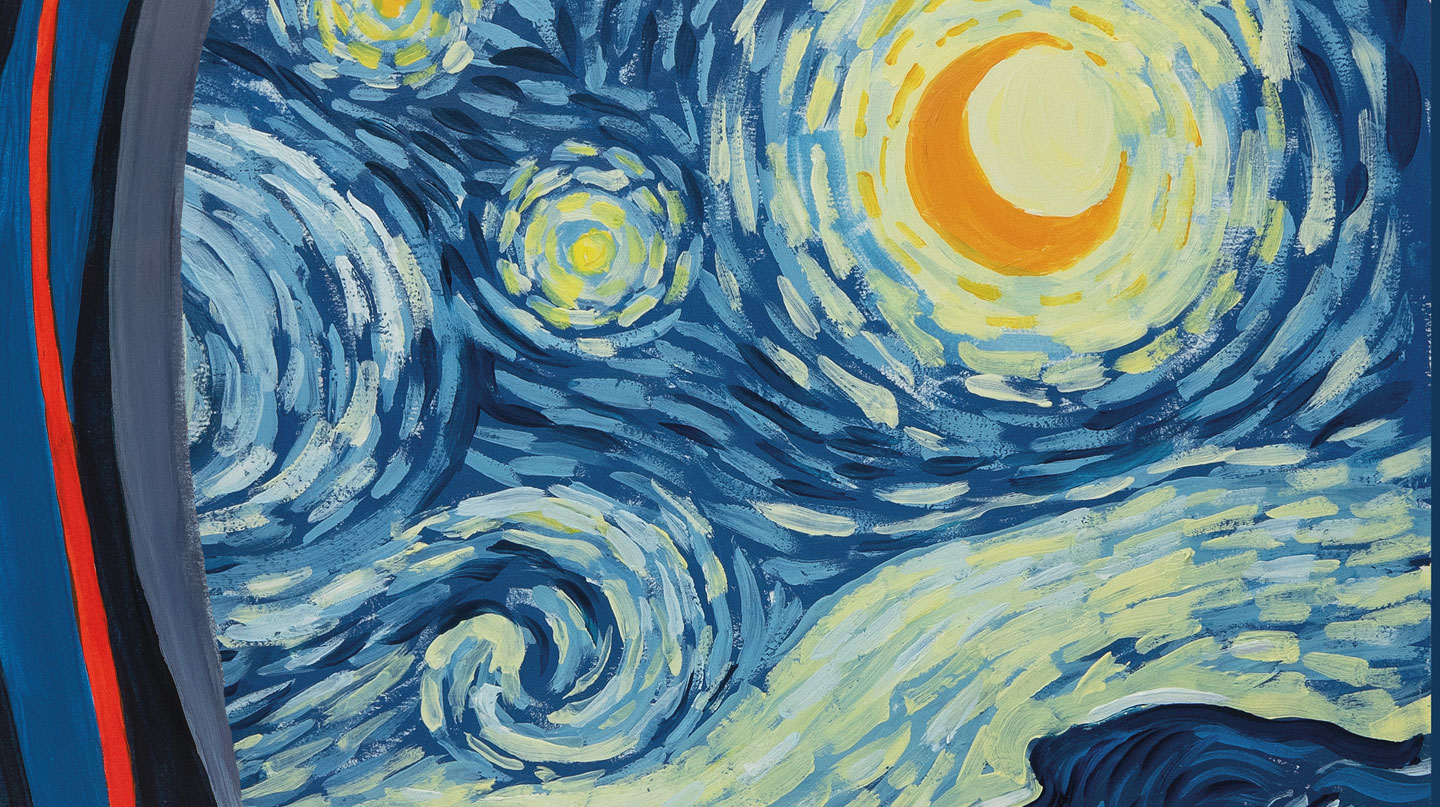
Wherever possible, each artwork was painted using the very product featured on the box. For example, the reinterpretation of Van Gogh’s The Starry Night was painted using Seawhite’s own water mixable oil paints. Likewise, the recreated watercolour paintings used Seawhite watercolours, while the oil paintings used Seawhite oil paints.
The packaging therefore becomes a genuine demonstration of the materials rather than simply an illustration.
Several of the original paintings have since been framed by Seawhite and are displayed in the company’s showroom as examples of the products in use.
Choosing the Right Artwork for Each Paint Medium
Each artwork was selected because it was originally created in the same medium as the product it represents.
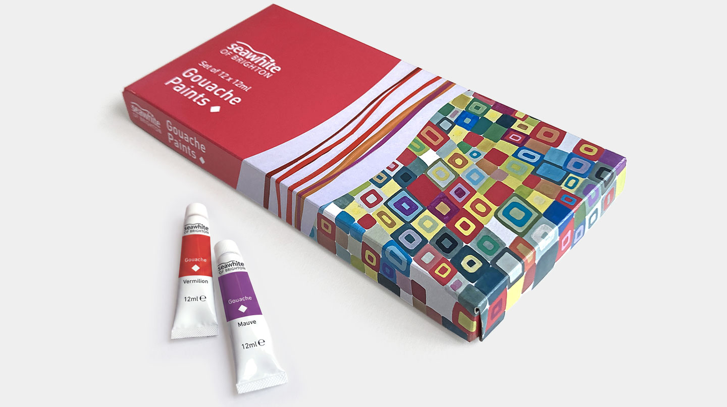
The gouache packaging draws inspiration from Sophie Taeuber-Arp’s Composition of Quadrangular Forms. The watercolour packaging references works by Edmund Dulac and Charles Rennie Mackintosh. The oil ranges reinterpret paintings by Henri Matisse and Gustav Klimt.
The only exception is the acrylic range. Acrylic painting is a comparatively recent medium, so few historically important acrylic paintings have yet entered the public domain. Instead, we based the design on a painting by Hilma af Klint, adapting it to create a strong identity for the range.
Original Artwork Inspired by Art History
Although each painting remains recognisable, every artwork includes original creative decisions.
Colours were adjusted to strengthen the packaging system and improve shelf impact. Some compositions were simplified, while others gained additional structure.
The student gouache packaging provides the clearest example. It began with Sophie Taeuber-Arp’s geometric composition, but evolved through a revised colour palette and the addition of smaller squares within each larger form. This second layer of detail was inspired by Chuck Close’s portrait grids and helped unify the overall range.
The objective was never to imitate famous paintings. Instead, it was to build new artwork that acknowledged its source while becoming part of a coherent product identity.
Colour-Coded Packaging Design
Colour plays several roles throughout the packaging.
Each paint medium has its own colour family, making products easy to identify on the shelf.
Those colours also connect directly with the specialist paper ranges that we previously designed for Seawhite. For example, the watercolour paints share a complementary green with the watercolour paper pads, creating visual continuity across different product categories.
A second level of colour coding distinguishes the two paint ranges.
The student products use brighter, lighter colours, while the artists’ range uses deeper, richer versions of the same hues. This subtle difference communicates product quality without changing the overall identity.
Branding Elements and Typography
Alongside the recreated artwork, every box includes the hand-drawn wave graphic that appears across much of the Seawhite packaging we have designed.
The wave acts as a recognisable brand signature. It echoes the wave found in the Seawhite logo, references the company’s origins in Brighton and helps tie together an extensive range of products.
We also developed a simple graphic symbol for each paint medium. Rather than representing quality level, these icons identify the material itself. Oil paints use a curled paint stroke, watercolours use a water droplet, while the remaining media each have their own distinctive symbols. These icons also appear on individual paint tubes, making the different products easier to identify.
Typography continues the wider Seawhite identity by using DIN Pro throughout the range, providing consistency and excellent legibility.
From Paint to Paper
The design approach developed for Seawhite’s paint packaging also informed the packaging for their premium Smooth Watercolour Pad.
Unlike the main Seawhite paper ranges, which use an abstract graphic system to distinguish different papers, this specialist pad adopts a more traditional visual language. The cover features an original illustration of a snakeshead fritillary, inspired by early twentieth-century botanical illustration and the Arts & Crafts movement.
The colour palette complements the green used throughout Seawhite’s watercolour products, linking the pad with the wider watercolour range. It also retains the hand-drawn wave graphic, helping to maintain a consistent identity across Seawhite’s packaging.
The result bridges Seawhite’s fine art paints and papers while giving the Smooth Watercolour Pad its own distinctive identity.
Paint Packaging Design for Seawhite
This project illustrates our approach to packaging design.
Rather than applying decoration at the end of the process, we build visual identities that communicate something meaningful about the product itself. Every decision, from artwork and colour through to typography and symbols, contributes to a coherent system that helps customers understand the range while strengthening the brand.
The result is a collection of packaging that works both as a family and as individual products, combining illustration, branding and product design into a single visual language.
Client’s Response
‘Seawhite competes against the biggest companies in the graphic arts industry and we feel that we have been fortunate to have found a designer who manages to hit the target so effectively. We find Toop Studio easy, pleasant and economical to deal with and the results have helped strengthen our brand.’
Nick Tobin
Marketing Director, Seawhite of Brighton
‘Shadric’s creativity, eye for detail and branding skills are second to none.’
Natalie Tobin
Marketing, Seawhite of Brighton