Logo Design, Branding & Business Collateral for Yellow Fish
Yellow Fish is a Brighton-based creative agency that began life in 2003 as an event management business. Since then, it has grown into a highly regarded brand experience agency, delivering bold experiences and powerful brand activations.
The Brief
Yellow Fish needed a clear, confident identity to establish itself in the growing corporate events market. The task was to create a strong brand foundation — including a logo, colour palette and launch materials — that would give the new company instant visibility and a professional, distinctive presence.
The Concept & Design
-
Colour Palette: A bold, unmistakable yellow was chosen as the core brand colour.
-
Logo: A clean, minimalist logo combining a stylised fish with a hidden “Y” in the tail, designed to be simple, memorable and versatile.
-
Visual Identity: The fish symbol became a central brand asset used across all communications.
Launch Materials & Brand Assets
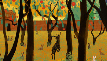
For the company’s launch, we designed an eye-catching brochure featuring a die-cut hole through every page, revealing the Yellow Fish logo printed on the back cover. This structure allowed for a series of illustrated pages that played with the logo in clever, unexpected ways and helped establish a playful yet professional tone.
Alongside the brochure, we produced business cards and a full suite of launch materials, giving Yellow Fish a cohesive and credible identity from day one.
Evolution & Business Success
Since the original branding work, Yellow Fish has expanded significantly, evolving from an event management company into a full-service brand experience agency with an in-house creative studio. The company later moved into new ownership as it continued to grow and diversify.
Credits
Brand Design & Art Direction: Shadric Toop
Brochure illustration: Steven Bannister.