


Store Branding – Bert’s Homestore
Background and Brief
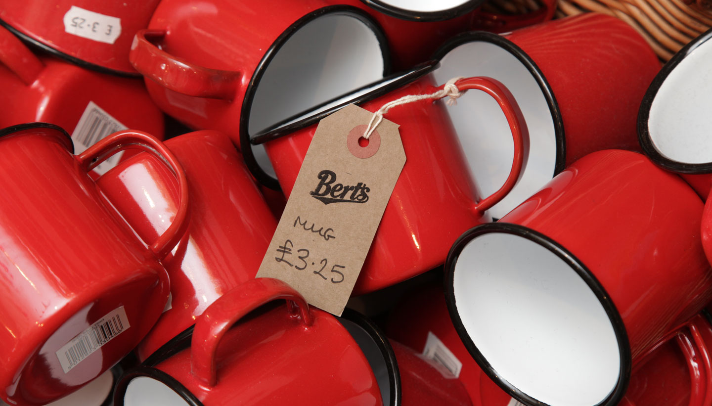
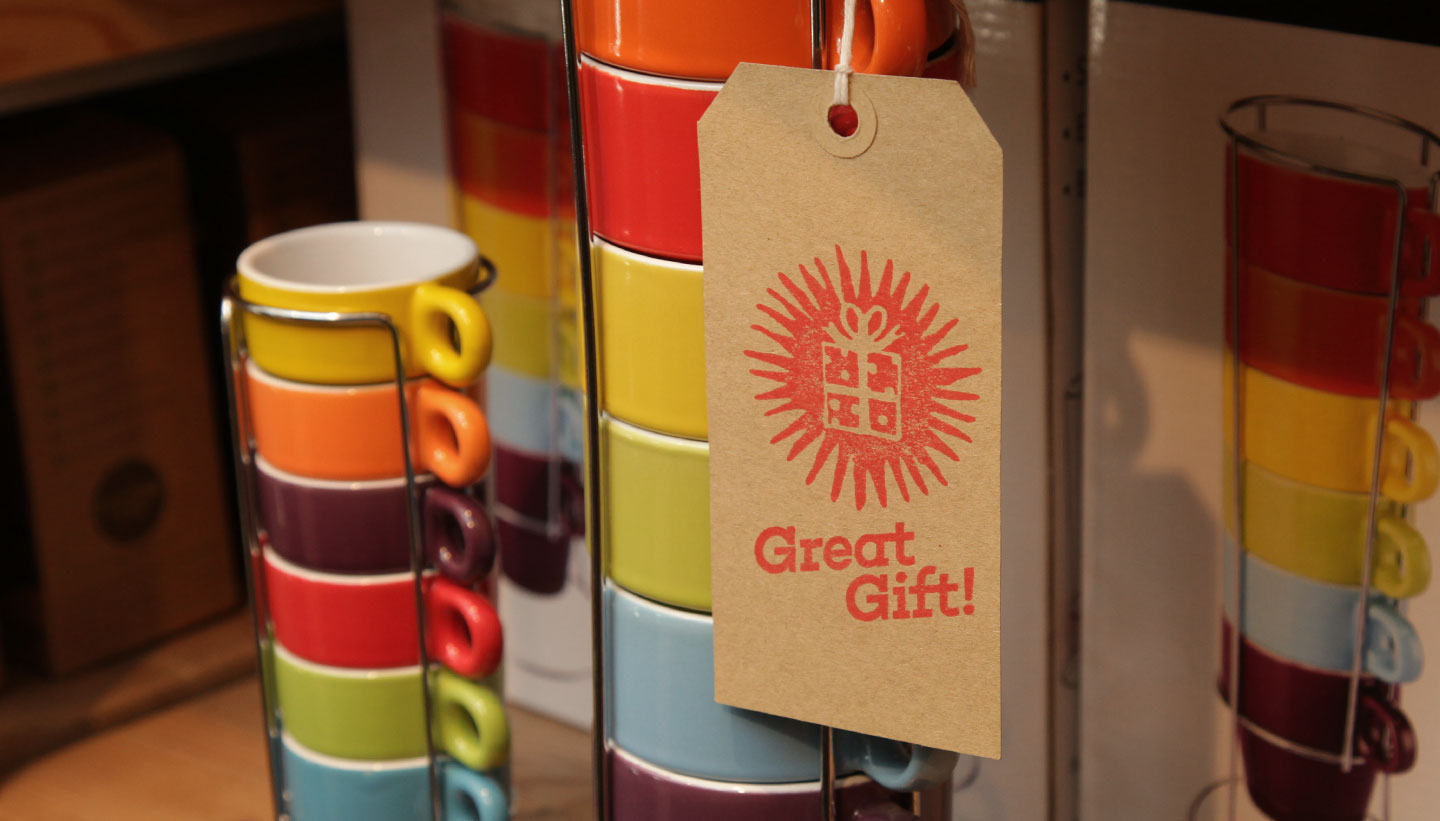
Bert’s Homestore sells a vibrant mix of cookware, home accessories, gifts and retro toys. They were established in 2005 with their first shop opening in Hove.
Ten years later they had grown into a city-wide institution in Brighton & Hove with three stores in the Brighton area. It was at this point they commissioned us to improve their branding.
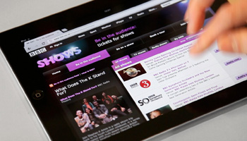
Our brief was to develop and broaden their existing store branding and to apply this to new packaging, their website and social media platforms.
The Outcome
When working with existing brands we like to keep what works and build on it; Bert’s Homestore was a perfect case study in this regard.
We wanted to keep the independent, non-corporate feel of Bert’s. Our approach, therefore, was to retain a low-key informality with the branding.
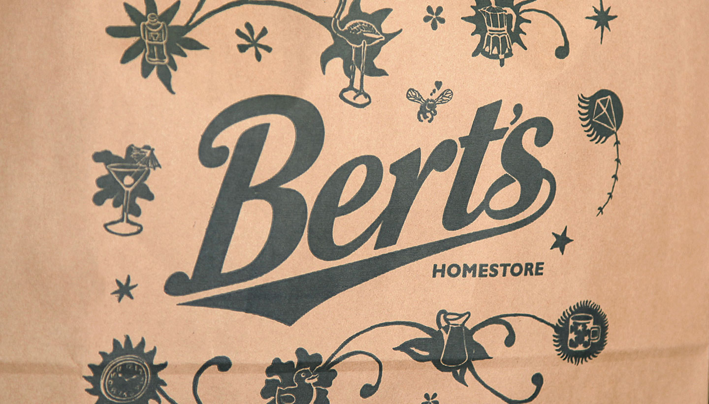
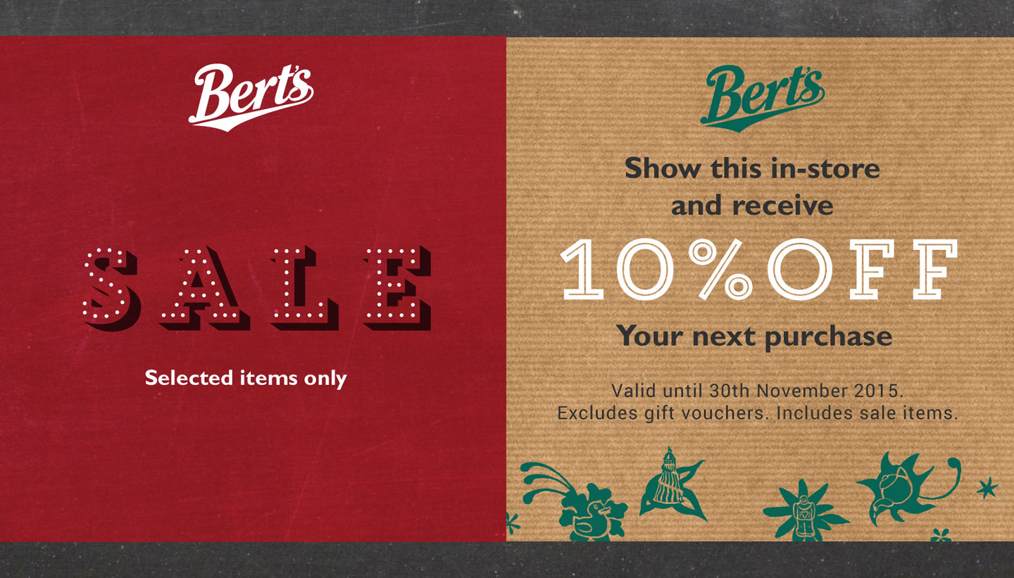
We liked the font used in their existing logo, which we felt just needed a few tweaks. We changed the green colour slightly and reduced the size of the word ‘Homestore’. A set of different versions of the logo were created, including a simpler circle version for social media. A hand-drawn version and a strapline version completed the set.
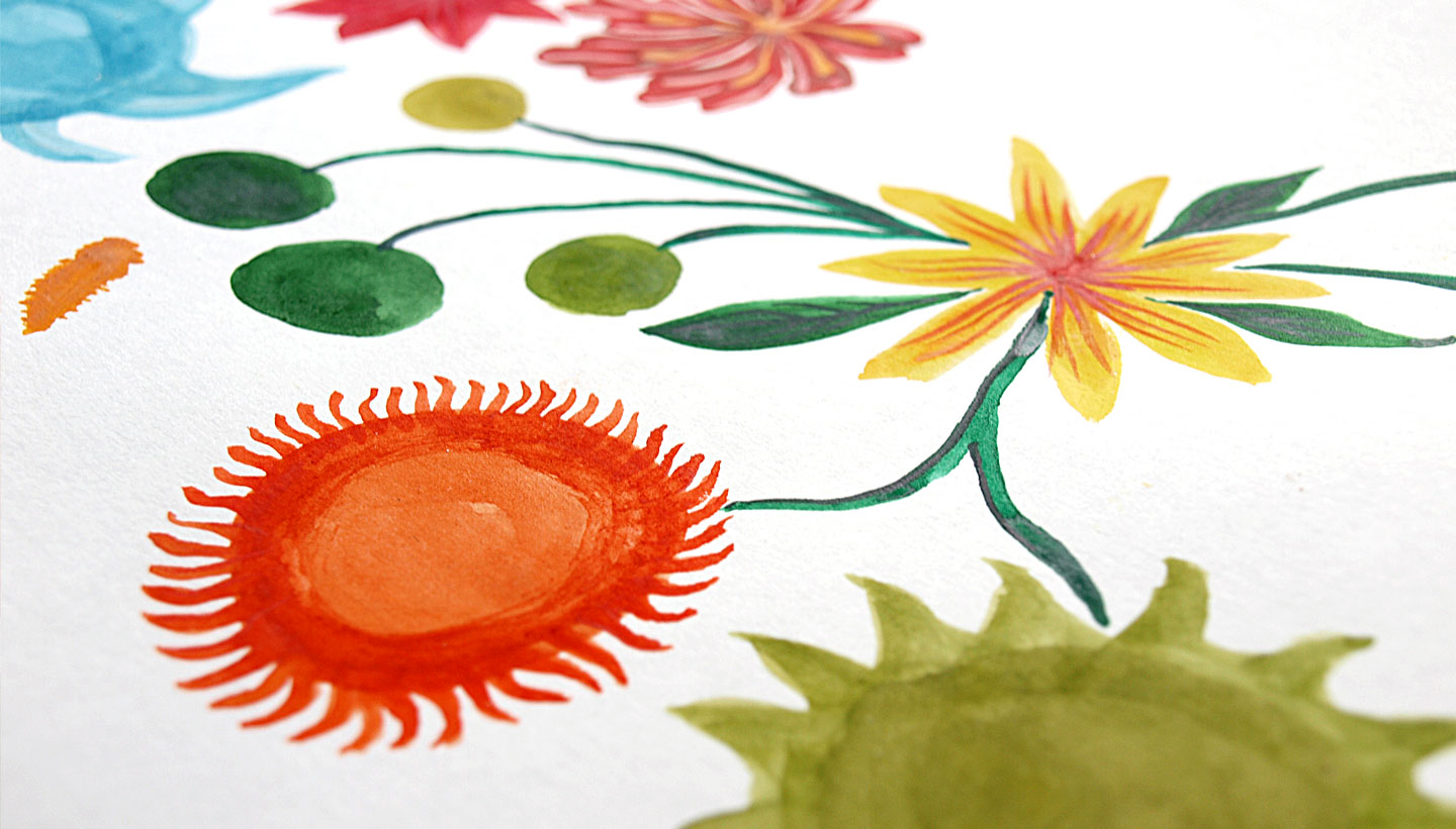
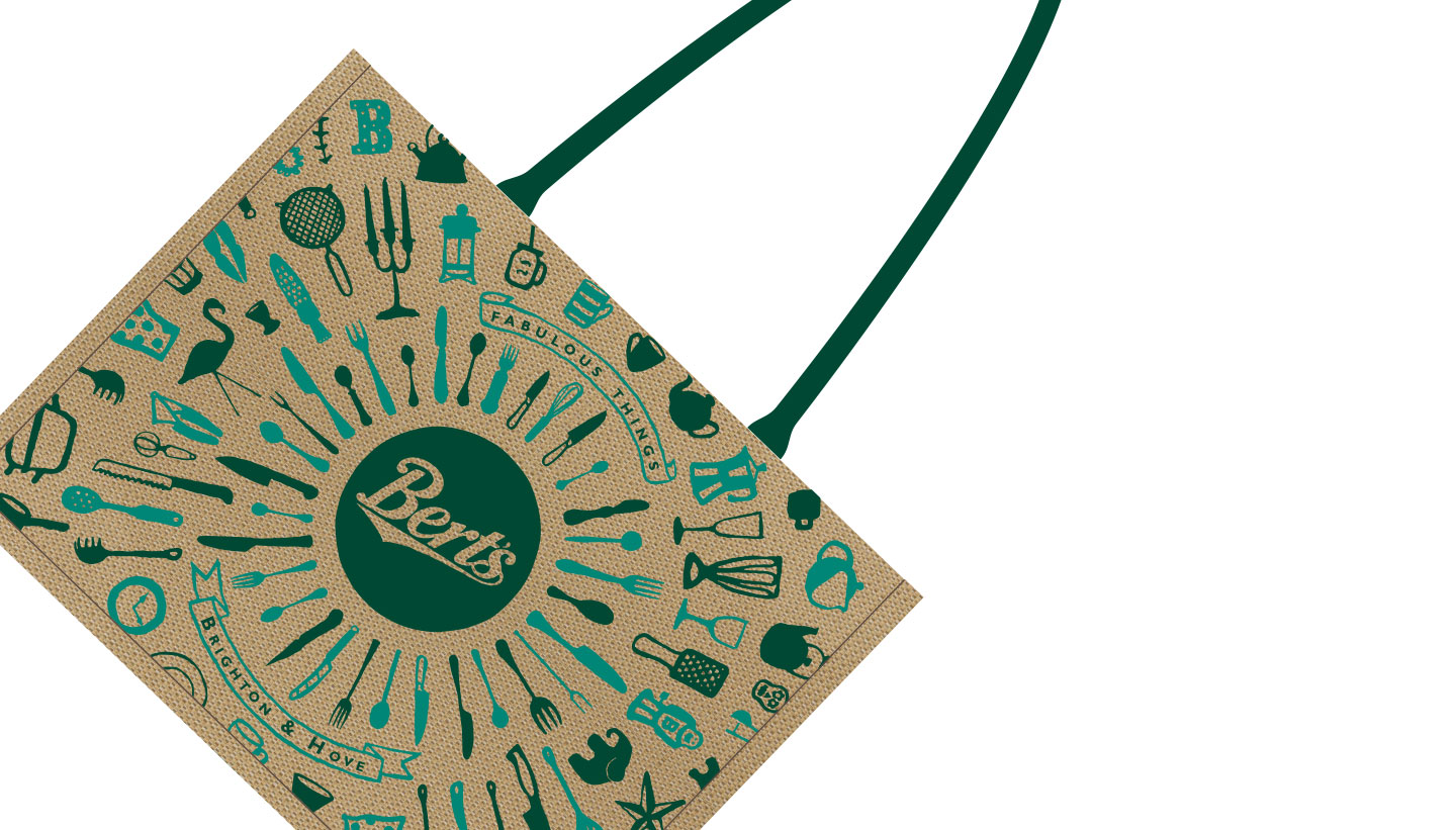
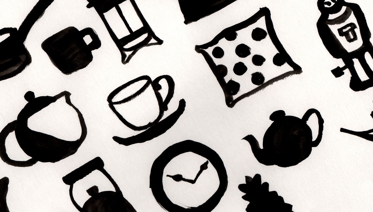
With the logo improved, we then focused on brand imagery. Firstly, we art-directed a new photoshoot. Secondly, we created several hand-made illustrations that reflect their informal store interiors and their decorative, quirky products.
Next, we introduced a new extended colour palette that reflected some of the more modern colourful products they sell. Finally, we came up with a new two-word slogan that helps sum up their offering: ‘Fabulous Things’.
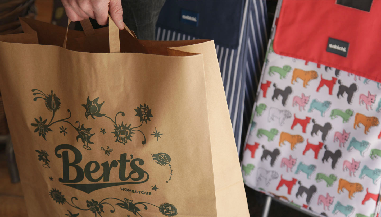
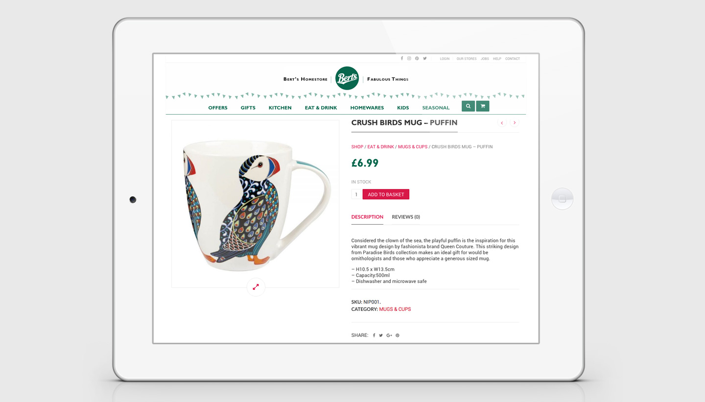
Using these new brand assets, we went on to produce designs for new retail bags, two website designs (a simple one-page version, still in use today, and an online shopping version), a set of social media templates, and in-store signage designs.
Project Legacy
This store branding project took place in 2015/2016. Writing today (in January 2023), we are happy to report that Bert’s has maintained most of the design elements we produced for them and their business is going from strength to strength.
We are particularly proud that the brown paper bags we designed (as featured at the top of this article) are still in use today.
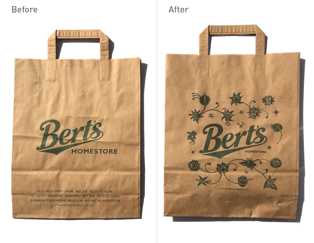
Brand refresh for Bert’s Homestore – Before and after bag design – Toop Studio
Bert’s opened a new branch in Worthing in 2020, and despite the pandemic, the business is thriving.
The Client’s Response
‘After 10 years of trading, our brand was in desperate need of a refresh. Toop Studio gave the brand a new lease of life by introducing a new colour palette, cohesive typography and exciting graphics to add to our existing logo. They also created a fabulous design for our website, liaising with the web developer to ensure we got exactly what we wanted.
Shadric Toop is endlessly patient and really took the time to understand and develop our brand – he is an absolute pleasure to work with.’
Andrew Earley & Jane Stewart
The management, Bert’s Homestore