Seawhite Art Pads – Product Branding / Packaging Design
The Brief
Seawhite of Brighton is a leading supplier of art materials to education in the UK. Their best-selling products are sketchbooks and art pads. In addition to supplying schools and art colleges, they also sell wholesale to retail shops throughout the UK, Europe and increasingly worldwide.
Our brief was to design new product branding for the whole range of Seawhite art pads. The range encompasses a huge variety of papers from cartridge drawing paper to tracing paper. The key goals of the brief were to:
- Embed a strong visual identity across the whole range
- Differentiate between the different pad types
- Ensure the Seawhite logo is used consistently
- Introduce a consistent template
- Establish a recognisable yet legible typographical style
- Distinguish Seawhite’s products from its competitors
With a customer base that includes all the top design colleges, the products are marketed to the ‘visually aware’. In addition, art pads are personal possessions to artists, whose tastes and demographics vary. Taken together, all these factors amount to a challenging brief.
Seawhite Art Pads – Our Design
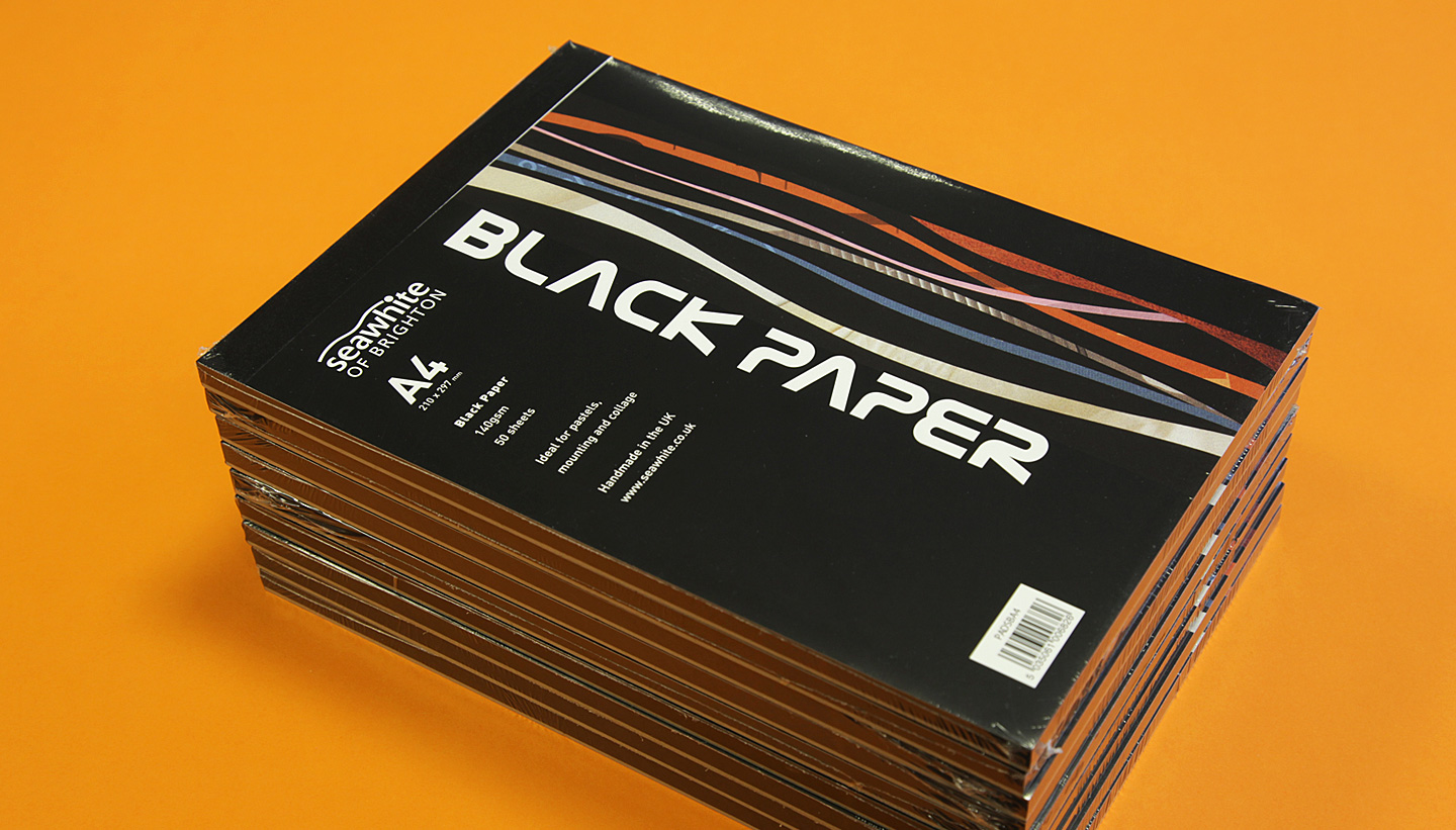
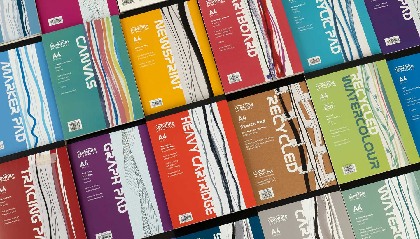
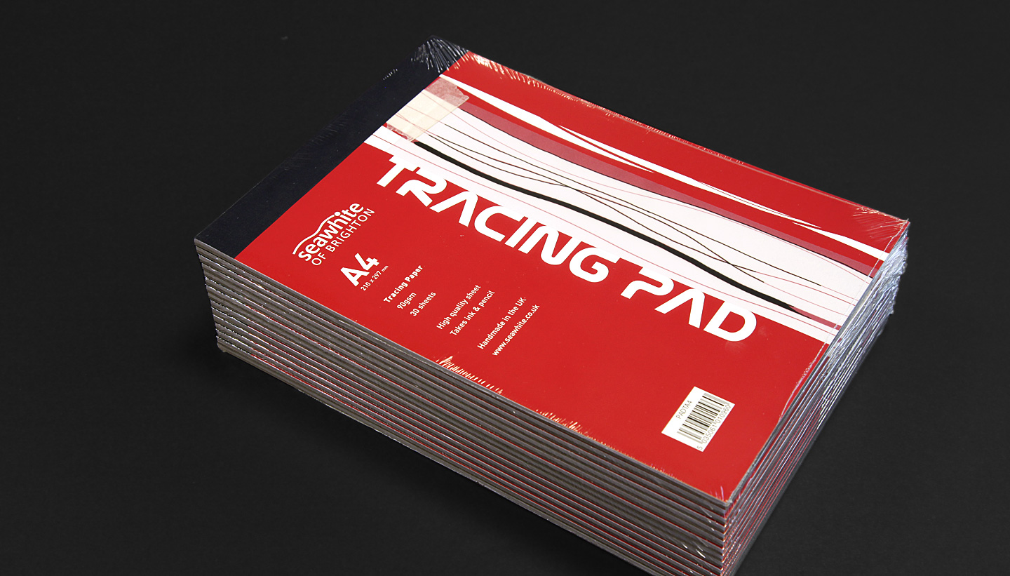
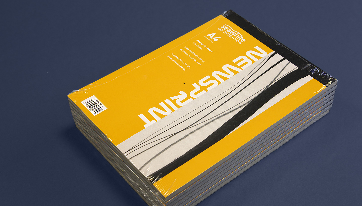
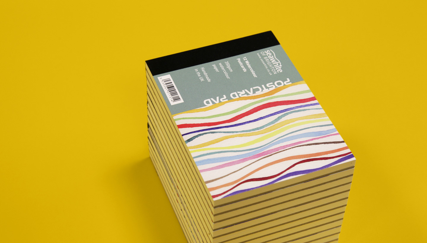
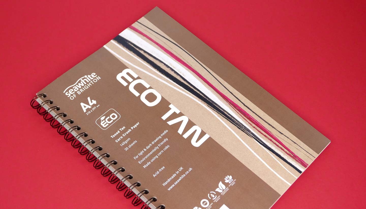
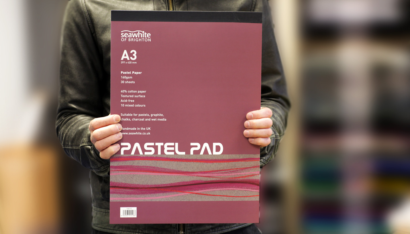
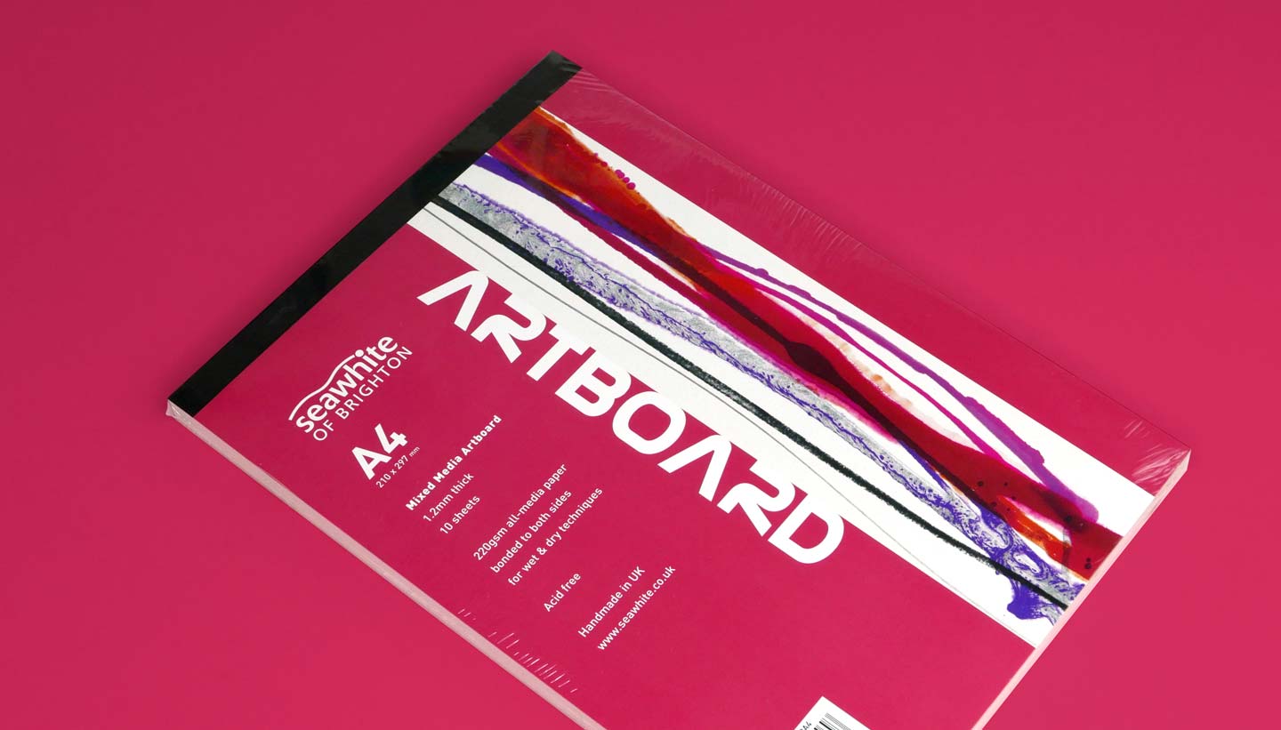
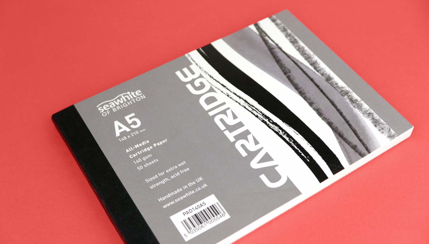
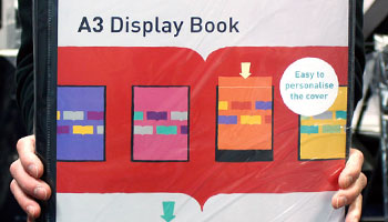
In a retail environment, these pads are on the shelves as a range. It was therefore important to communicate quickly with the product branding what type of paper each pad contained. We did this by colour-coding each type of pad. In addition, we created an image strip showing the actual paper in use. This image strip demonstrates some marks made by an appropriate material – such as watercolour, graphite pencil, pastel, collage etc.
The ‘wave graphic’

Seawhite Art Pads – The Wave Graphic – Toop Studio
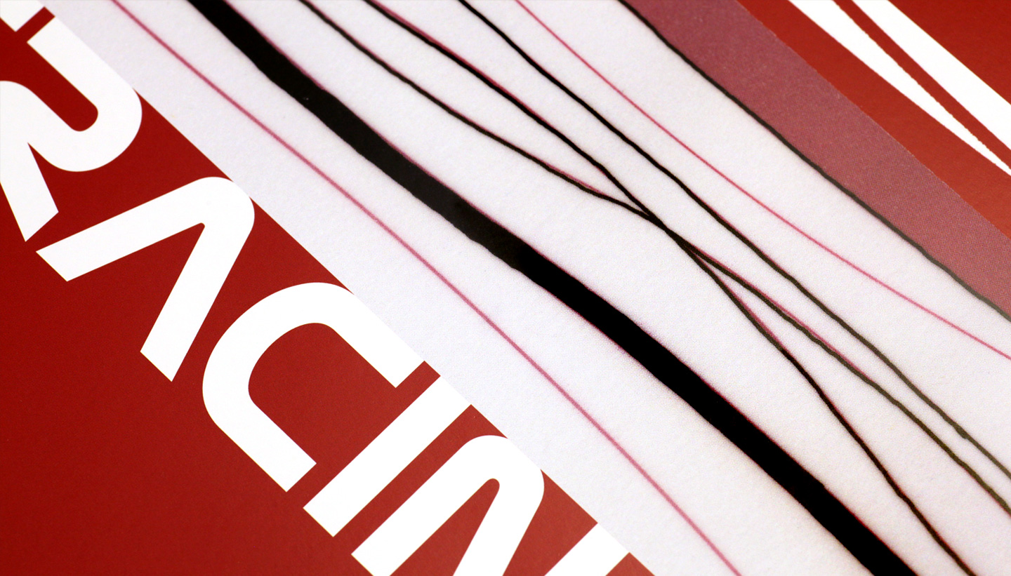
In order to make the most of the image strip in branding terms, we came up with ‘the wave graphic’. The wave graphic is an adaptable, hand-made ‘wavy line’ graphic device which ties the range together. It hints at the wave in the Seawhite logo and ultimately symbolises the sea. Brighton is the original home of the company (and the full name of the company is still ‘Seawhite of Brighton’).
For each pad type, we created a new wave graphic. Along with its own colour, this gave every pad in the range its own subidentity.
The template
We created designs to make the most of each size in the range (from A5 to A2). For instance, the A4 template runs the wave graphic and title along the long edge. For the A3 template, we ran it along the short edge. This gives the range more consistency in terms of visual weight.
The typography
When it came to typography we opted for two typefaces. For the product name, we went for a font that was eye-catching and memorable: Nasalization. This sans-serif typeface has a modern-retro charm, with a nod to the 1975 Nasa logo. For the specification text, we used the Din family for function and legibility.
The Client’s Response
‘I can say that Shadric’s designs have helped propel sales of our pad range beyond expectations. Seawhite competes against the biggest companies in the graphic arts industry and we feel that we have been fortunate to have found a designer who manages to ‘hit the target’ so effectively. We found Toop Studio easy, pleasant and economical to deal with and the results have helped strengthen our brand.’
Nick Tobin
Marketing Director, Seawhite
